VELA
Improving the safety and enjoyability of surfing
Tools
Google Forms
Pen and Paper
Balsamiq
Adobe XD
Role
User Researcher and Designer
Methods
Competitive Analysis, Interviews, User Journeys, Affinity Mapping, Wireframing, Prototyping, User Testing
00. TL;DR
Problem
Surfing is a sport that requires constant adaptation. Factors such as wave height, wind, tide, and location all have an impact on how a surfer approaches a session. Considerations beyond conditions have an impact as well - crowd size, amenities, or hazards can deter surfers from going out. Selecting the right location to surf can be the difference between getting stoked and getting skunked.
Solution
Using weather charts and user data, Vela is an app that gives surfers of all skill levels the information they need to make an informed choice on when and where to surf.

01. What Features Do Competitors Lack That Users Want?
Competitive Analysis
Before jumping straight into designing, I first researched other apps that offer similar weather and water information to find common features, missed opportunities, and areas of improvement. Understanding the product, current market, users, and unfulfilled opportunities will provide direction to my design. No need to reinvent the wheel!
Goals
- Discover what are the common features of other surf apps
- How can these features be improved?
- Find missed opportunities or missing features that would separate Vela from competitors
Key Findings
- Saved locations are immediately accessible once the user opens the app
- Search function should be intuitive and provide additional filters for users to find preferred locations.
- Rely on Jakobs Law when designing, that is, design for patterns for which users are accustomed.
User Interviews
Although I am a surfer myself, it is important not to bring my own biases and preferences into the design process. I interviewed 5 surfers on the beach to ask about their experience with other surf apps and what information they look for, what influences their surf spot selection, and what they desire in an app.
Goals
- Discover the most desired features the user expects in a weather forecasting app
- Understand the behavior of a user when it comes to preparing for a day on the water
- Discover friction points in current surf apps and how to improve on them
"You can only find things through search. It doesn’t allow for discoverable spots. It’s kind of a pain."
- Zach, 32, Huntington Beach

Affinity Map
From there, I categorized responses to organize and discover patterns. I further separated answers into two categories; one focusing on location-specific needs, and the other, a more general desired app experience.

Key Findings
- Safety is important to surfers of all abilities
- Easily discovering new spots is difficult
- On average, surfers consistently surf a rotation of 3-5 locations
- Amenities like parking and showers are highly desirable
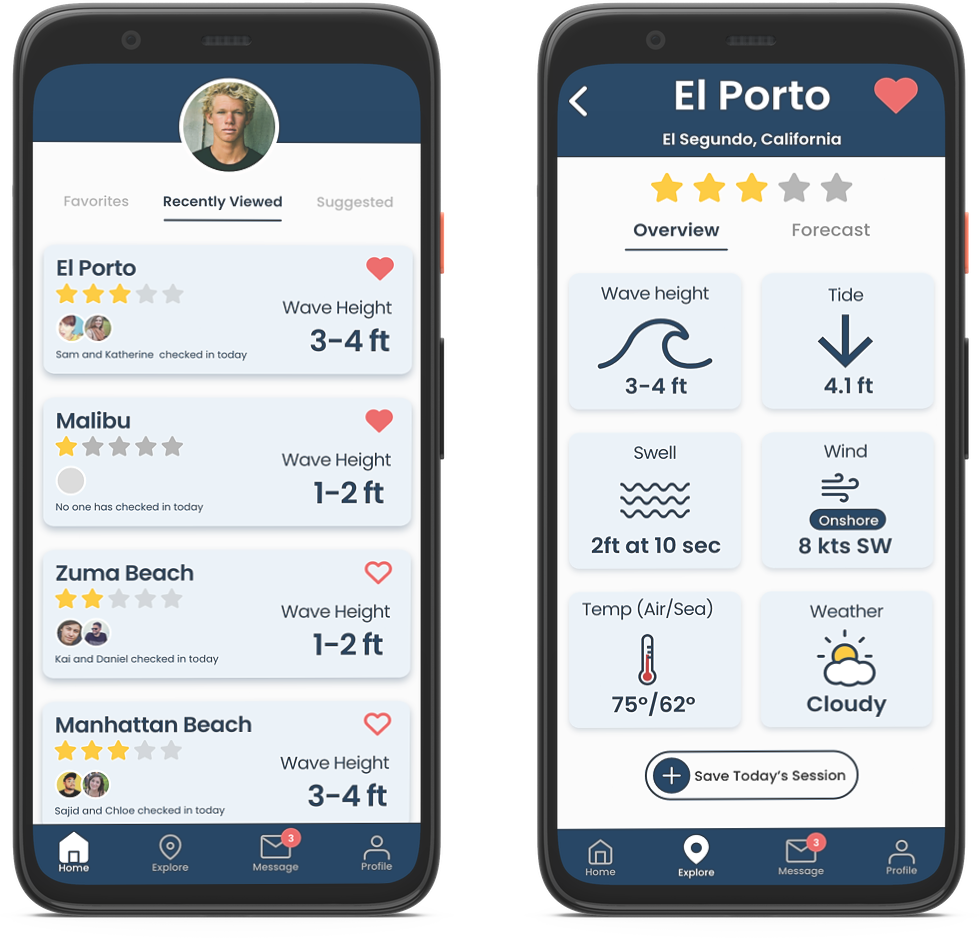
02. Understanding the User
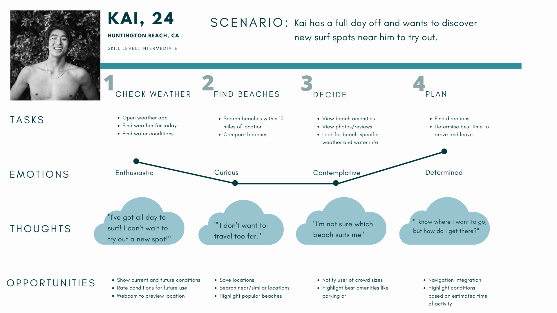
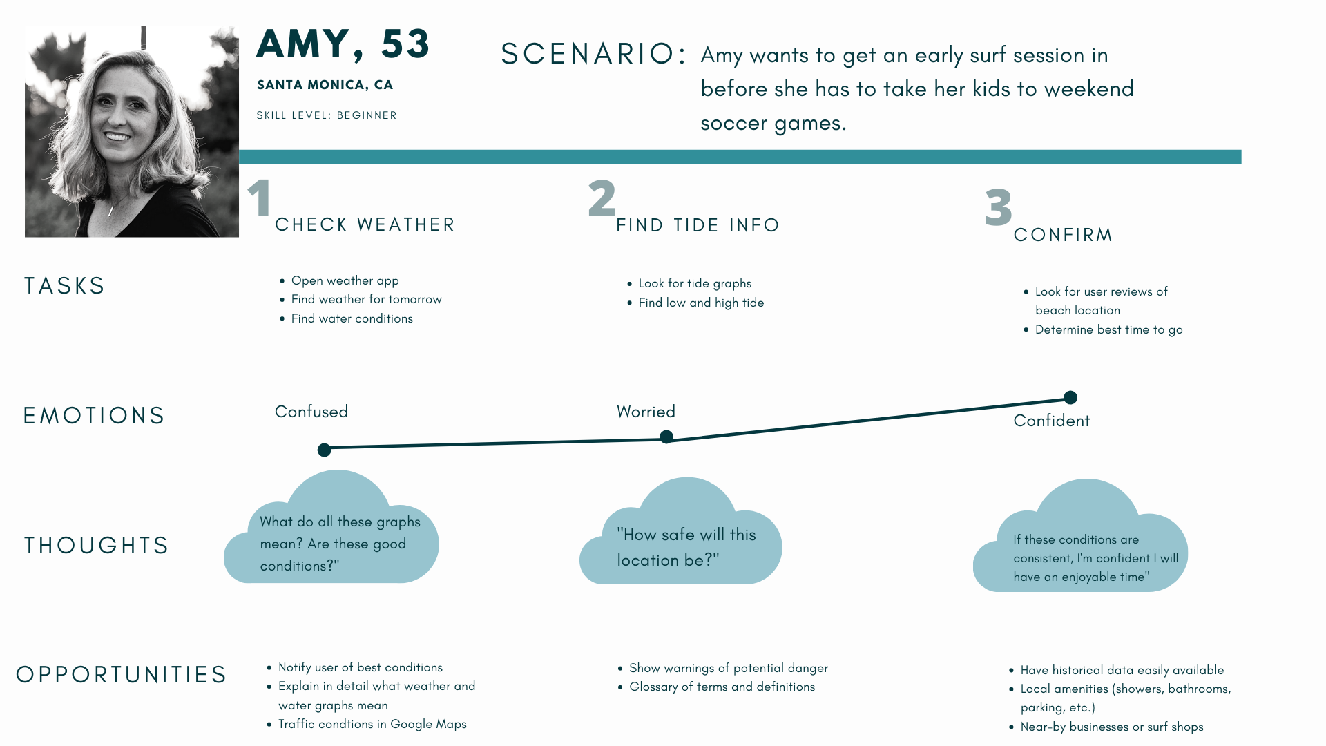
User Journey
Emotions play a large role in how a user interacts and perceives an app, so it is important to emphasize delight and minimize frustration. I used an amalgamation of information I gathered from user interviews and surveys to create two distinct user personas. Each have their own level of skill, priorities and desires when navigating a surf app.
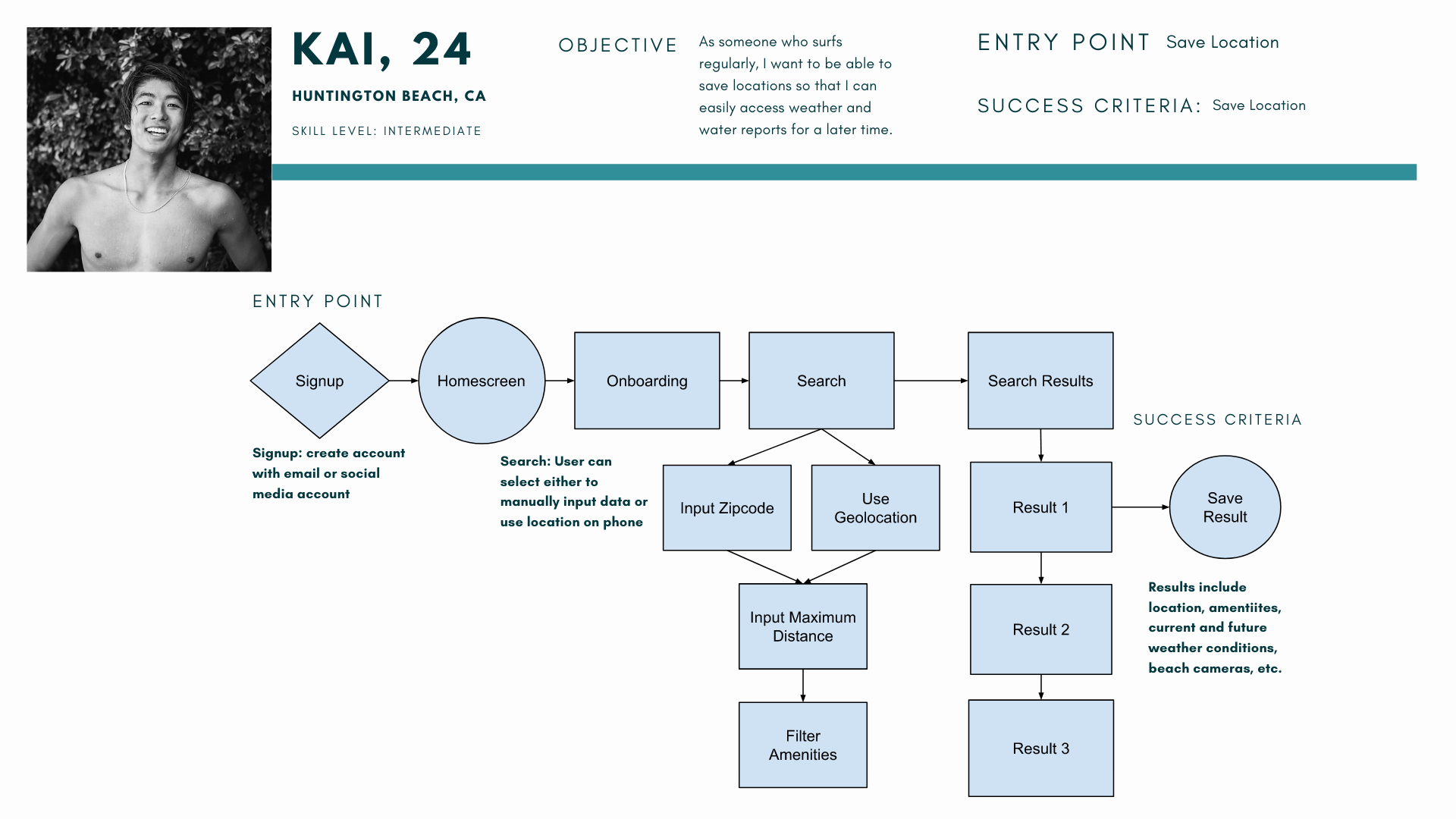
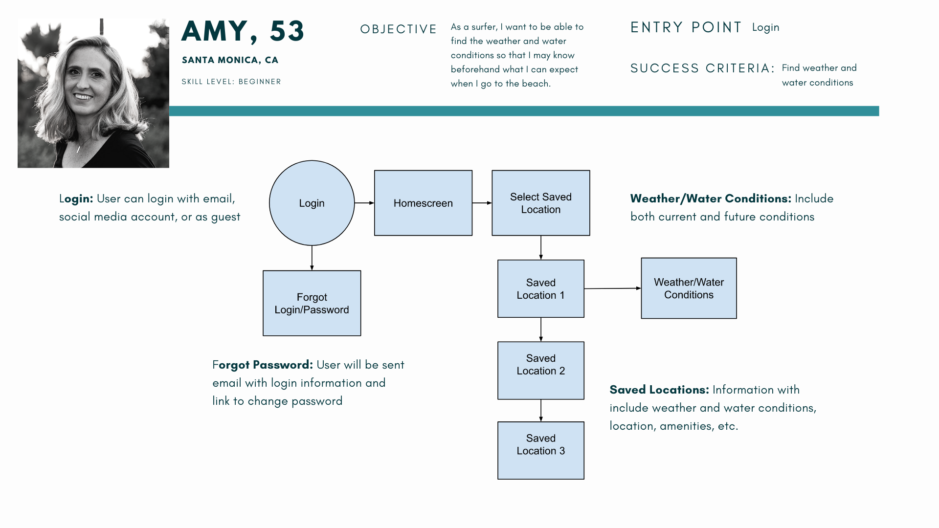
User Flows
Every user is different with different goals, so multiple user flows must be considered. Simplicity is heavily favored; my goal is to help the user accomplish their goals in as few actions as possible. Less time spent navigating the app is more time spent in the water.
03. Design Iteration
By sketching out low, mid, and high-fidelity prototypes, I am able to see my design ideas come to life. It's important to quickly sketch ideas to see if the layout is intuitive and design choices make sense. In retrospect, I was too committed to my initial design idea and was forced to pivot as you will see later.
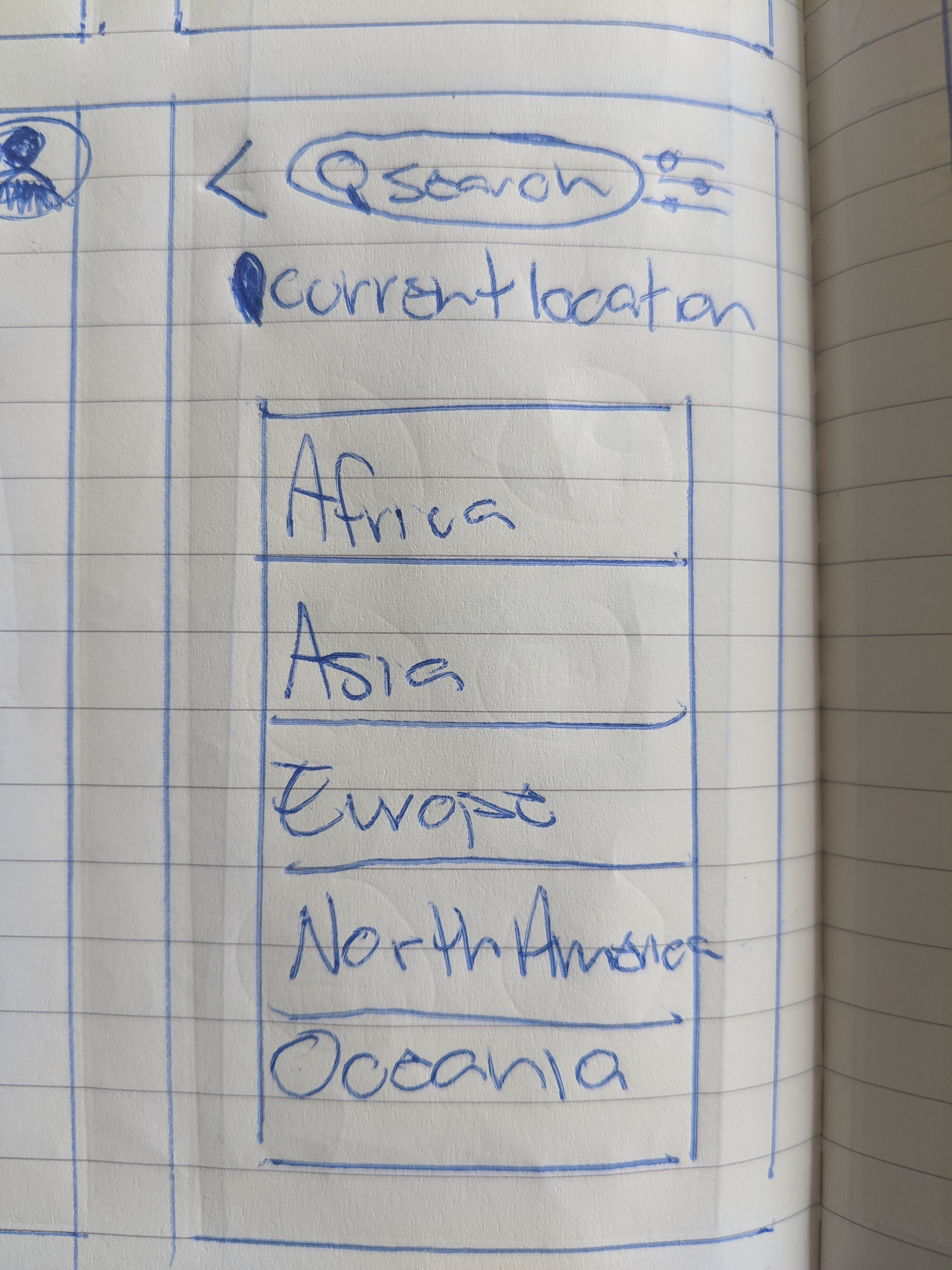
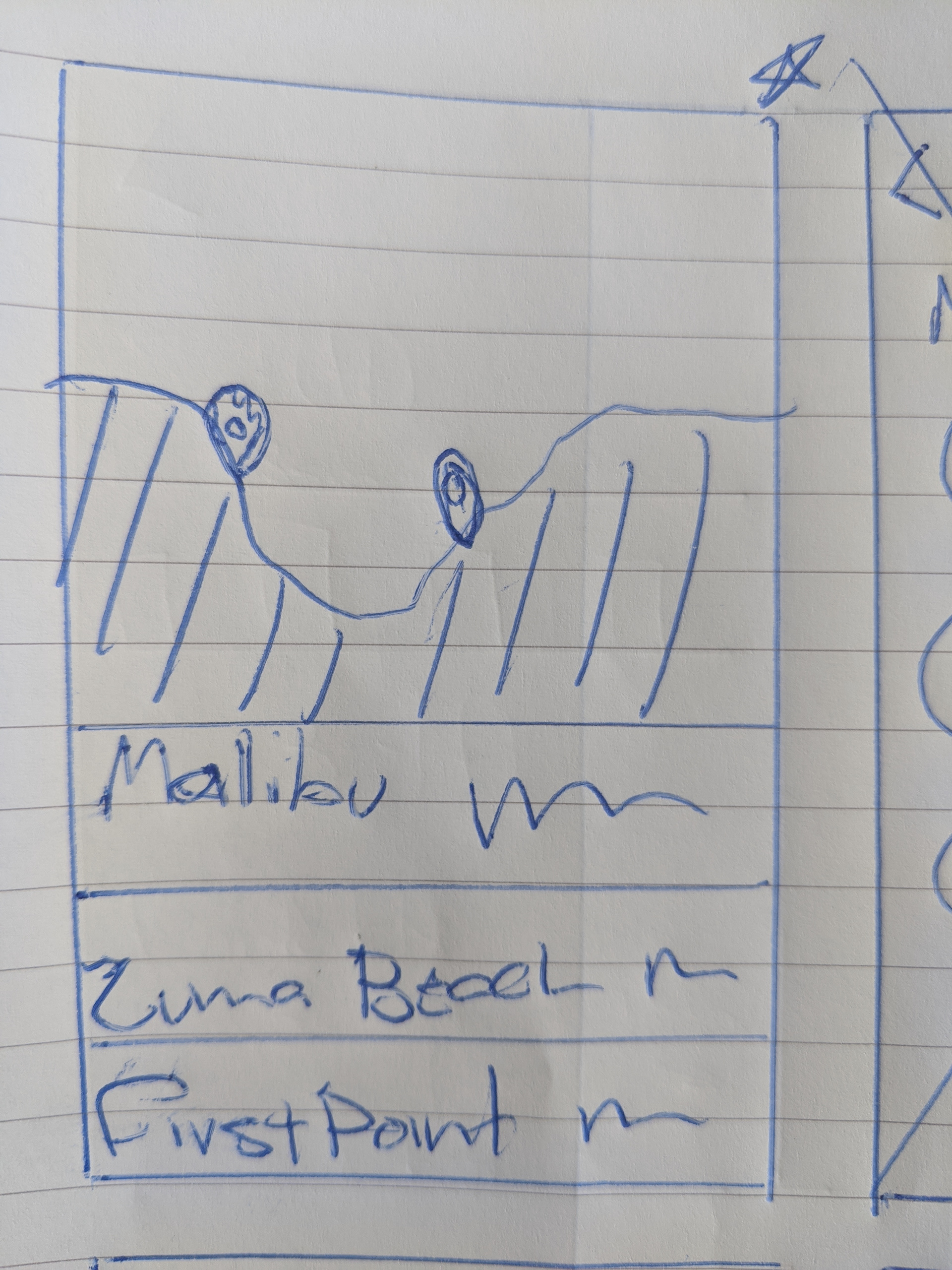
Low Fidelity
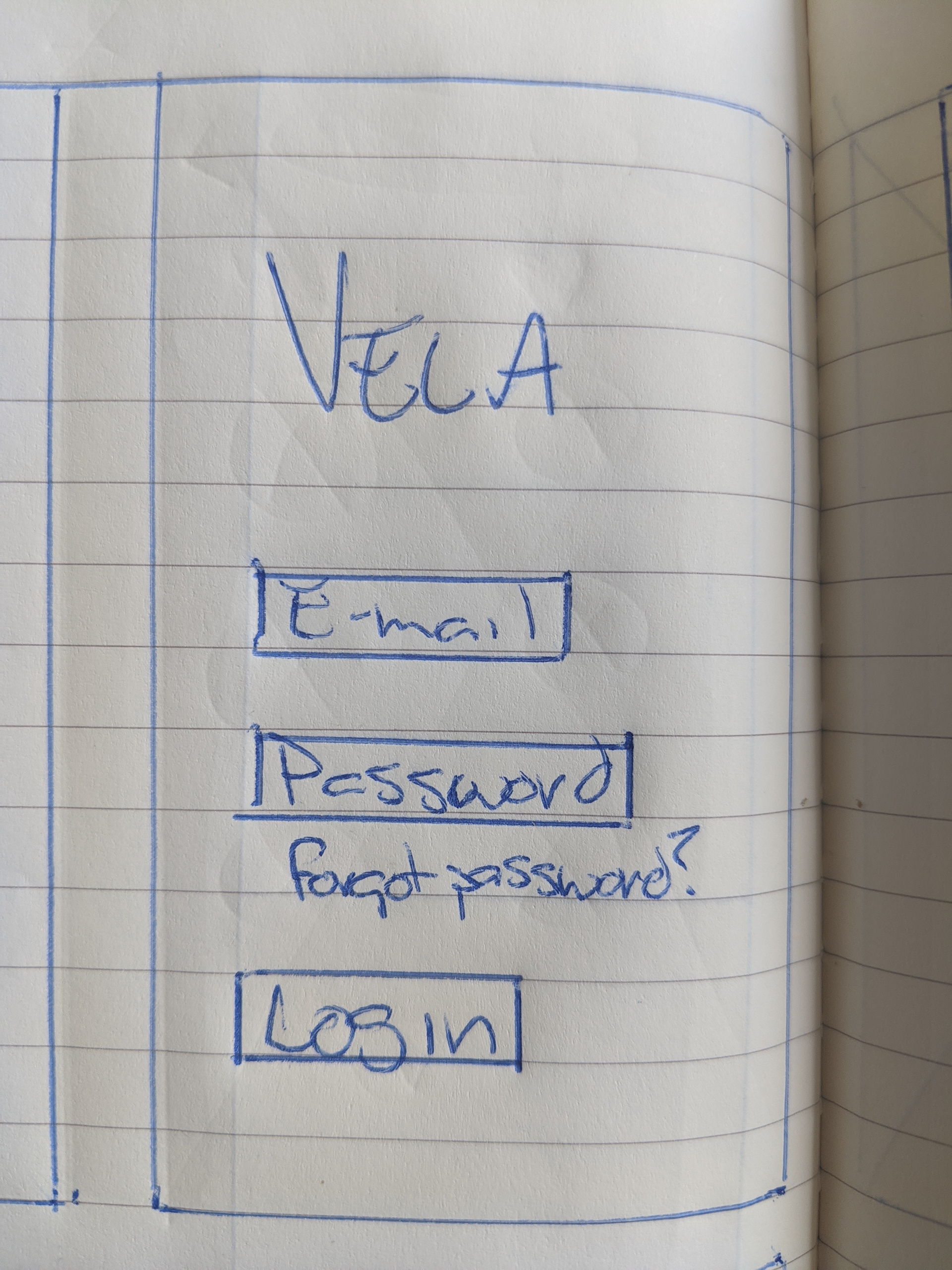
Login
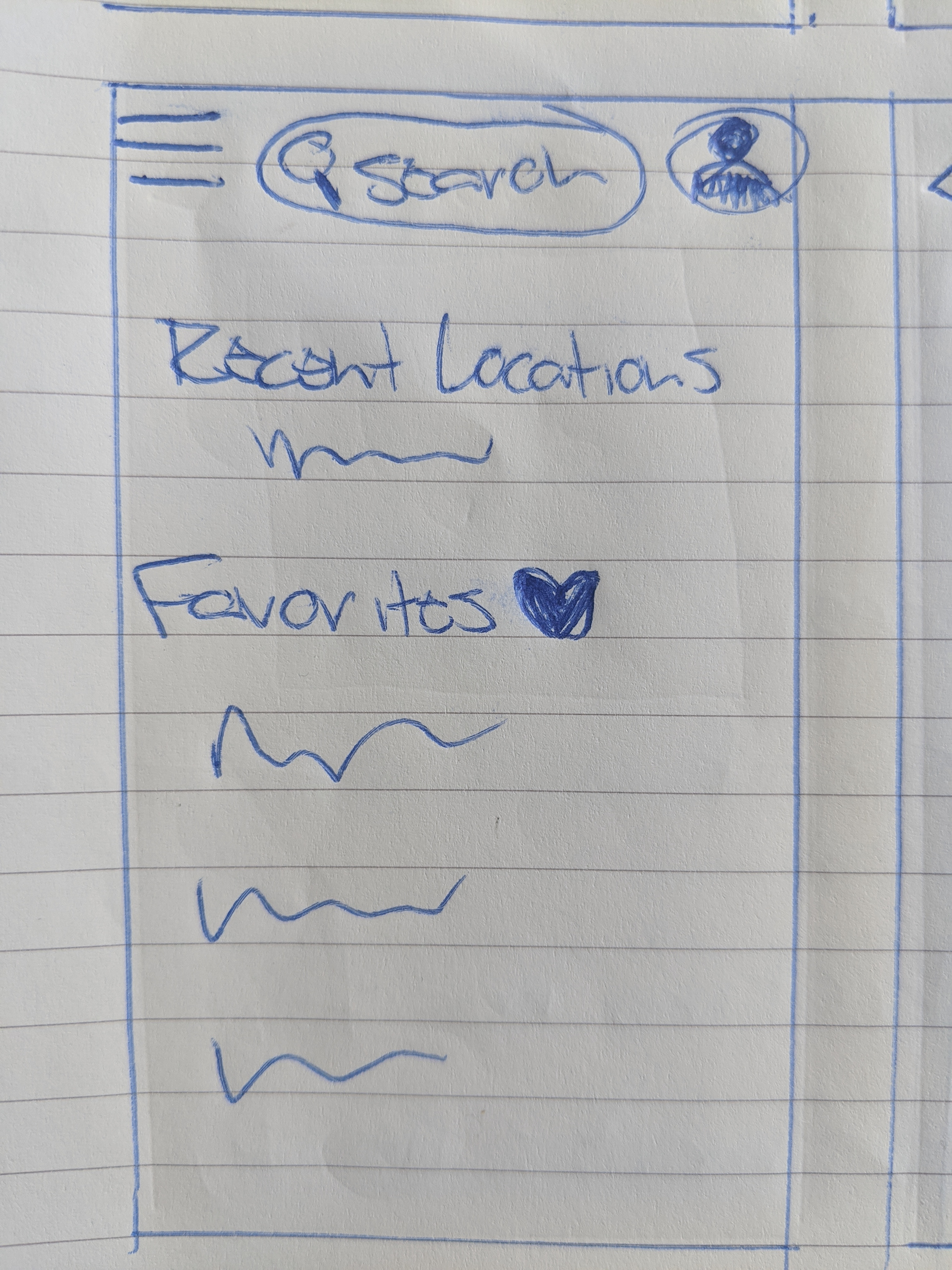
Home
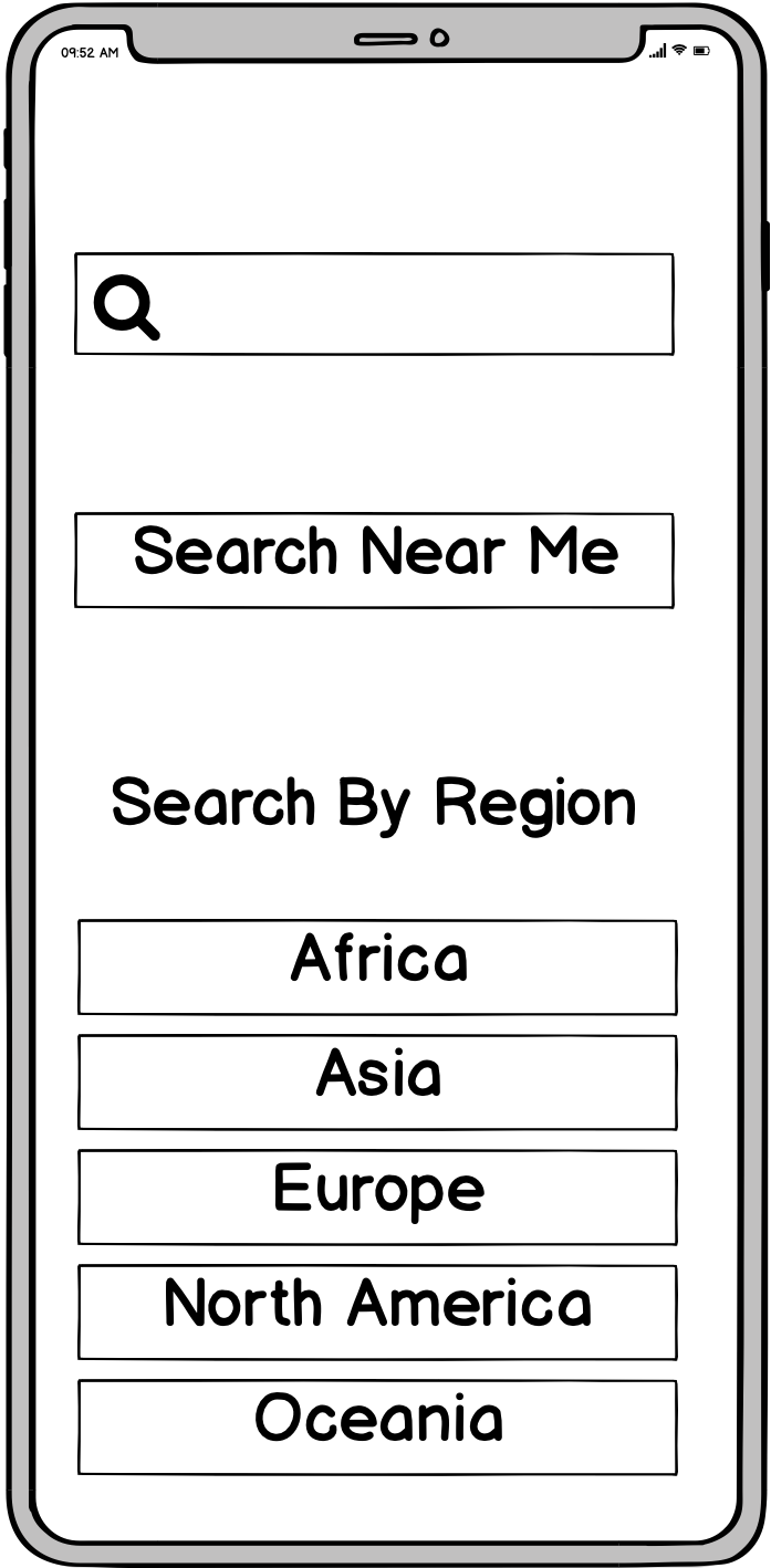
Search
Geo-search
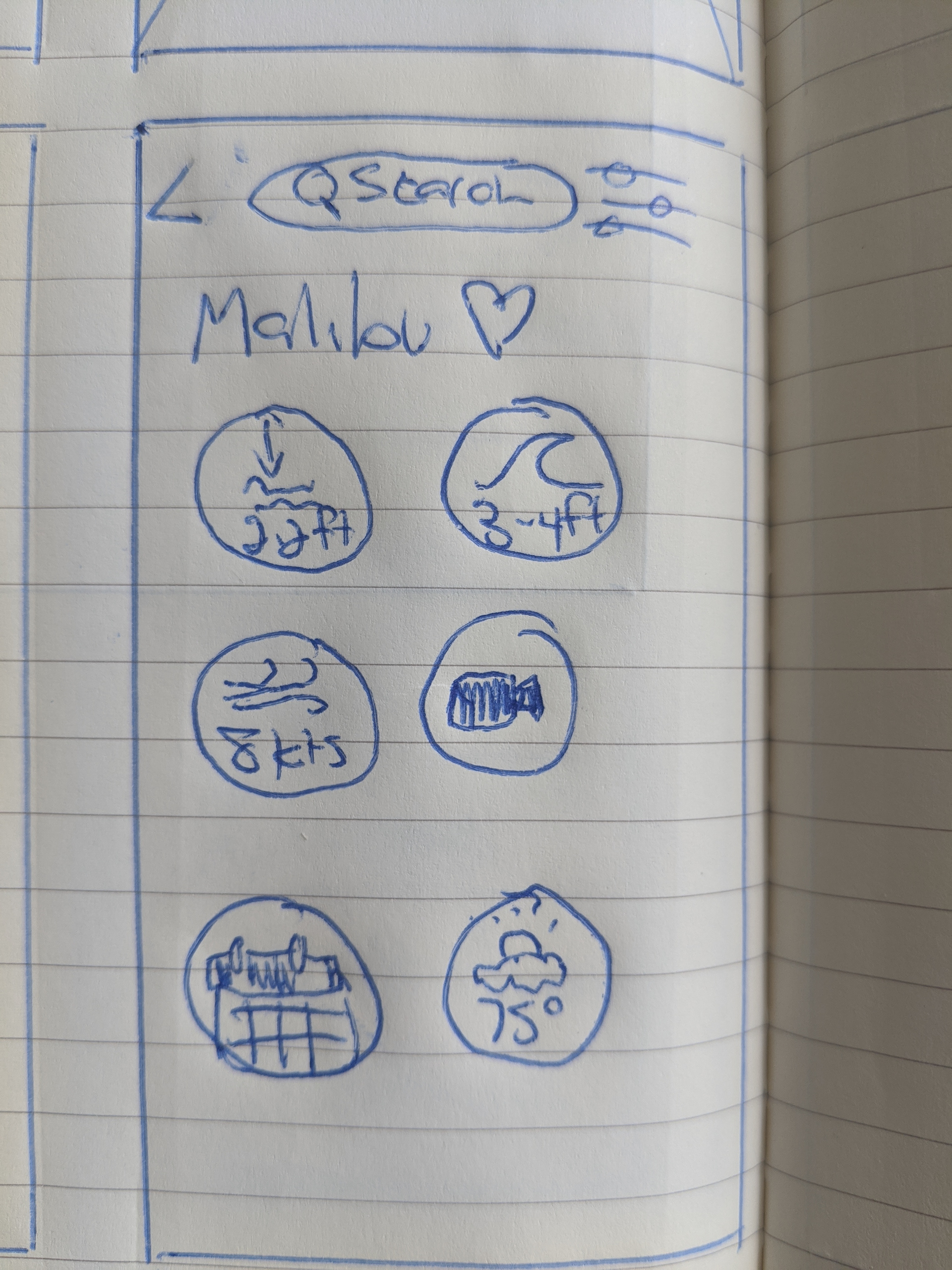
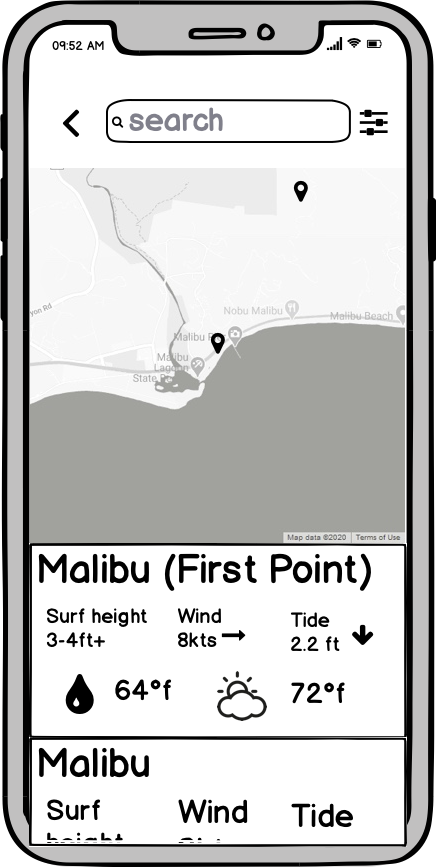
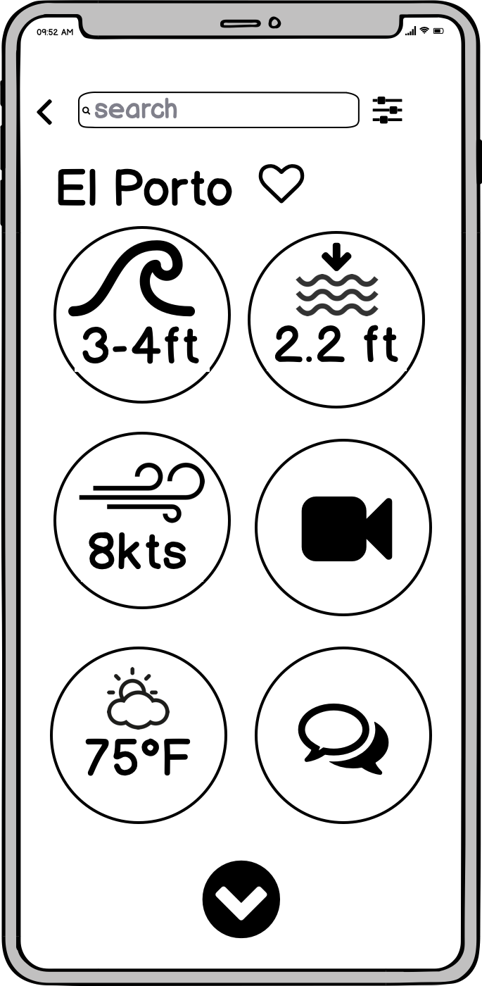
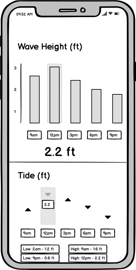
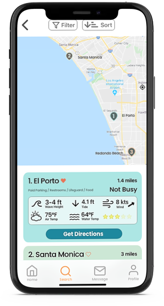
Location
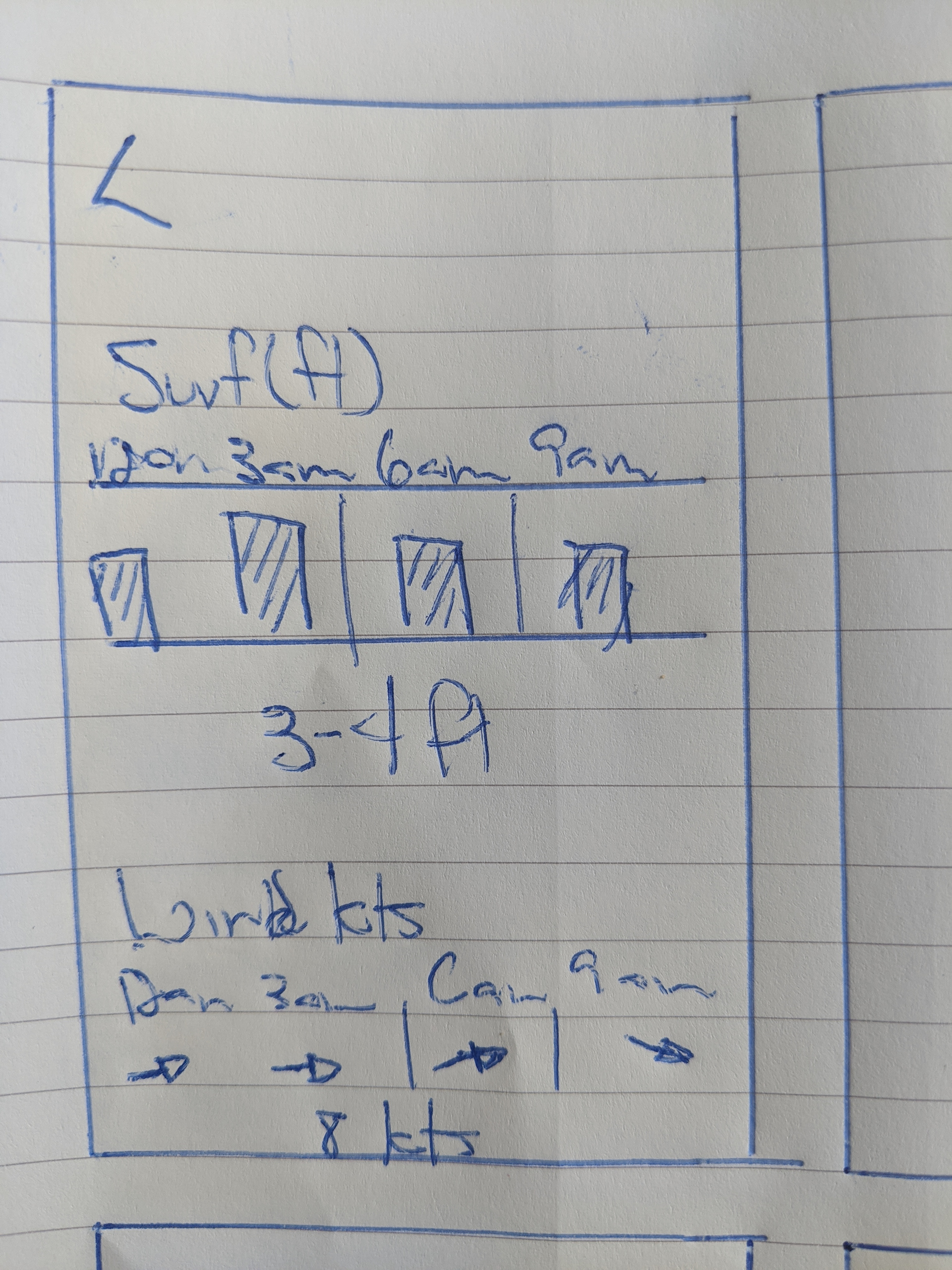
Location cont.
Mid Fidelity
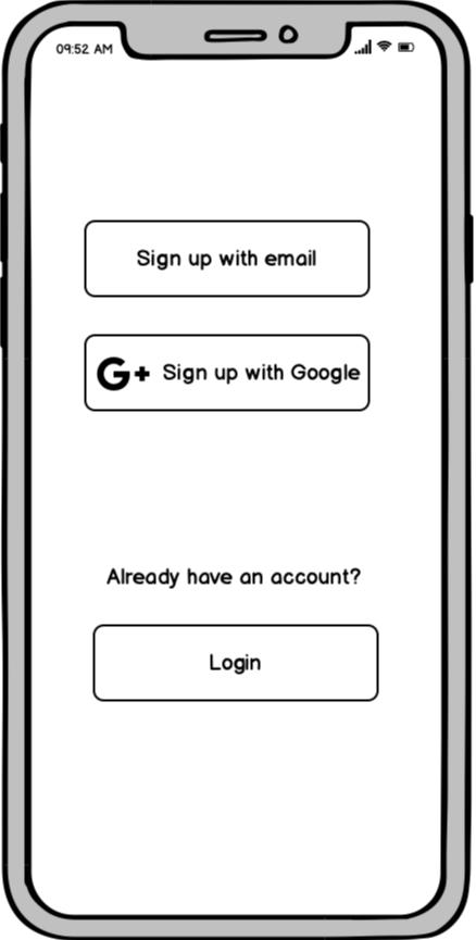
Login
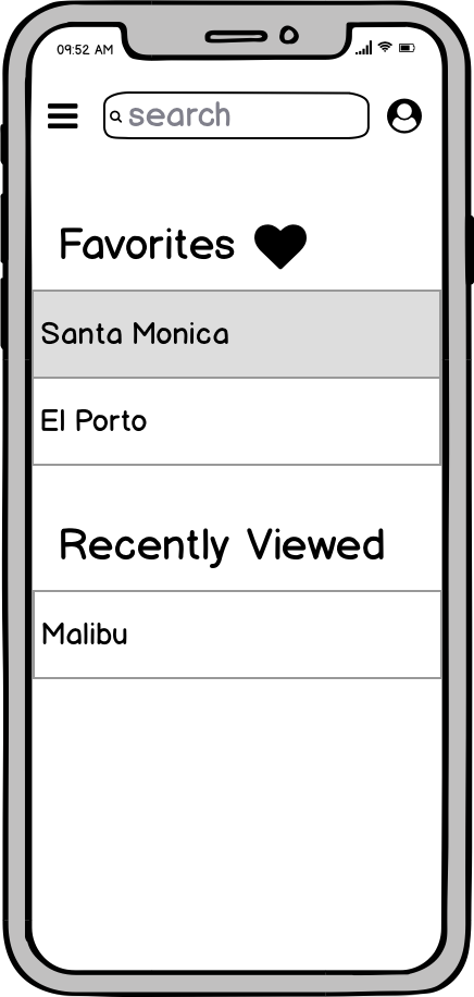
Home
Search
Geo-search
Location
Location cont.
High Fidelity
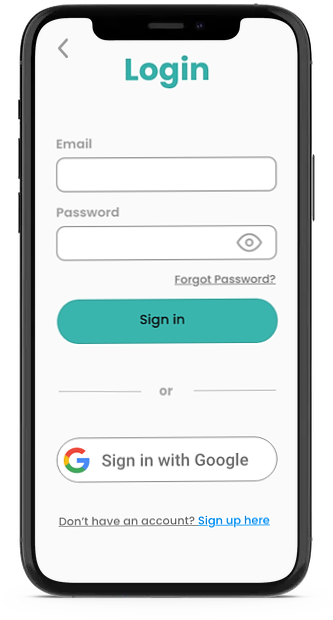
Login
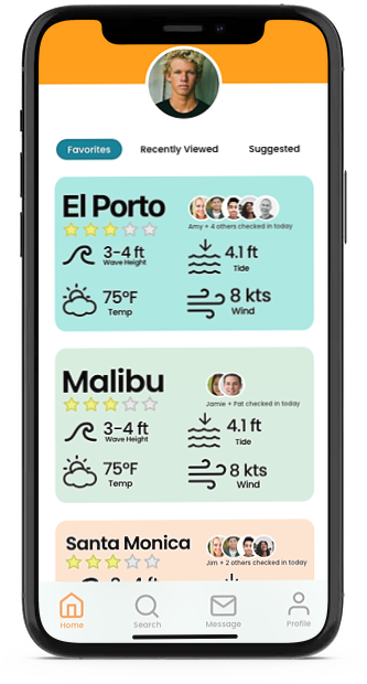
Home
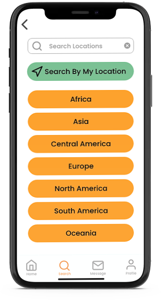
Search
Geo - search
Location
Location cont.
04. Validating Design Hypothesis
User Testing and Design Changes
User testing was performed with 6 participants to confirm that core features and functionality are easy to use and discover usability errors. I chose user participants who are not familiar with surfing or water sports to test the accessibility and ease of use for a broader audience. The onboarding process, as well as primary use cases, will be tested, including searching for a location near users, adding location to favorites, and checking current weather/water conditions.
You can access the script I used for user testing here.
Goals
- Test core features to see if they align with users intuition
- Discover friction points
- Explore user's initial impressions of the app
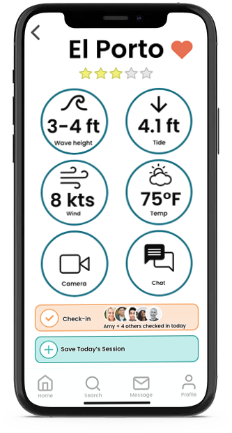
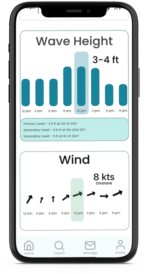
Issue 1: Users were unable to clearly define where to find forecast and future weather information
Severity: High
Suggested Change: Add menu to indicate forecast information
Evidence: 4/6 users either misidentified or could not easily locate forecast information
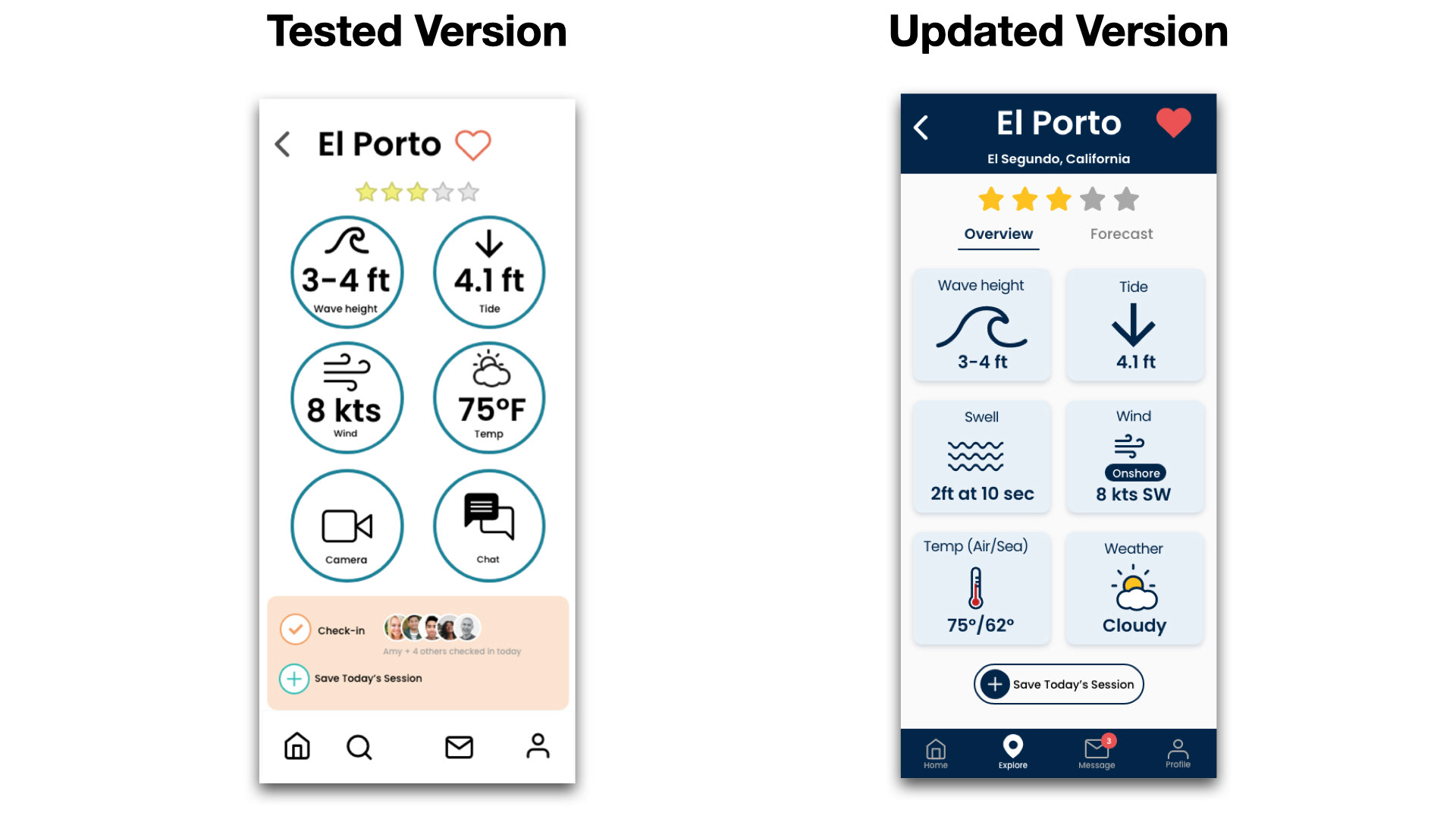
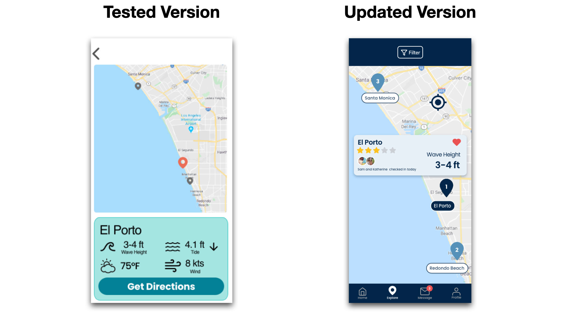
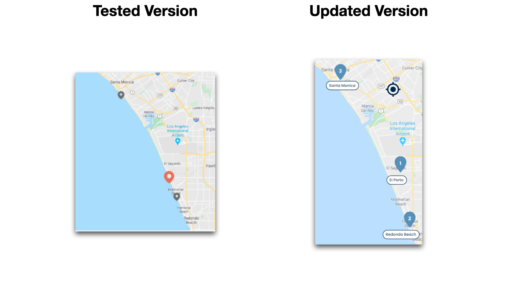
Issue 2: Search result page is not clear to users on relevancy
Severity: High
Suggested Change: Establish better information hierarchy with numbered results
Evidence: Users were often confused about which location was located on the map.
Issue 3: Users couldn't identify current location relative to search locations
Severity: Medium
Suggested Change: Use different icons for location and search results
Evidence: 50% of users misidentified the first search result pin as the current location
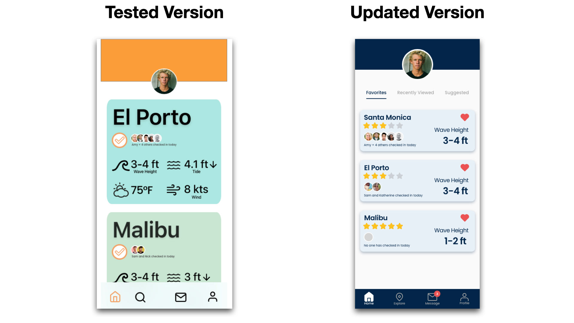
Issue 4: Users unaware of the location of favorites on the home screen
Severity: High
Suggested Change: Apply "Favorites" and "Recently Viewed" labels to locations on the home screen. Additionally, add confirmation that the user has added a location to favorites.
Evidence: Once a favorite was added, 50% of users were confused about where they could find their favorite locations.
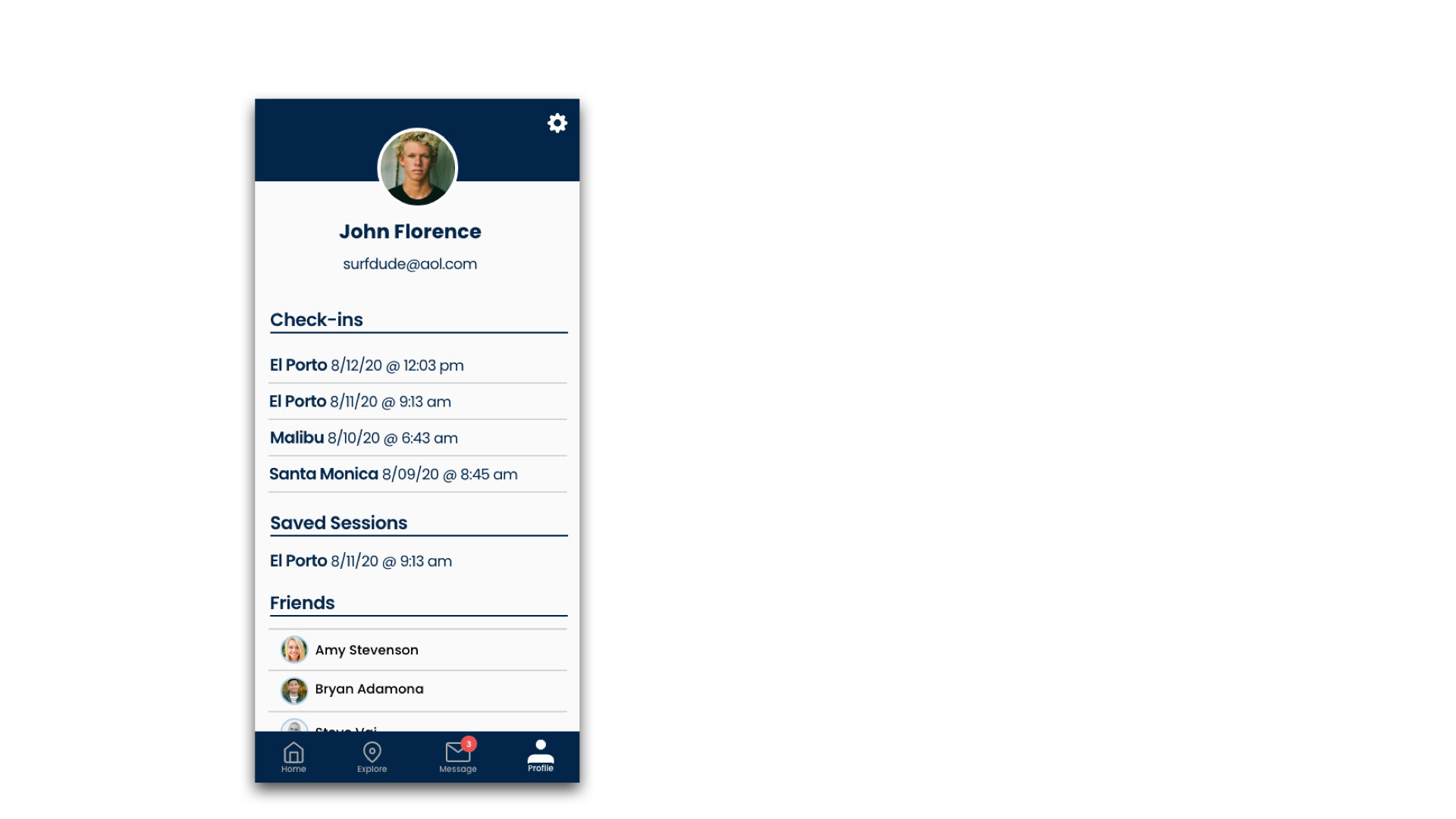
Issue 5: User profile lacking relevant features
Severity: High
Suggested Change: Expand user profile features such as check-in history, friends list, etc.
Evidence: Users expressed the desire to see more detailed information in the user profiles and were often confused about where to add friends.
Key Findings
- Users often experience an app in different ways. Some are easily confused, while others can safely navigate without assistance. Design for those who are confused.
- Unless explicitly told, users cannot differentiate between features
- Follow-up questions are crucial when it comes to decision-making and understanding user behavior, "Why did you choose X over Y?"
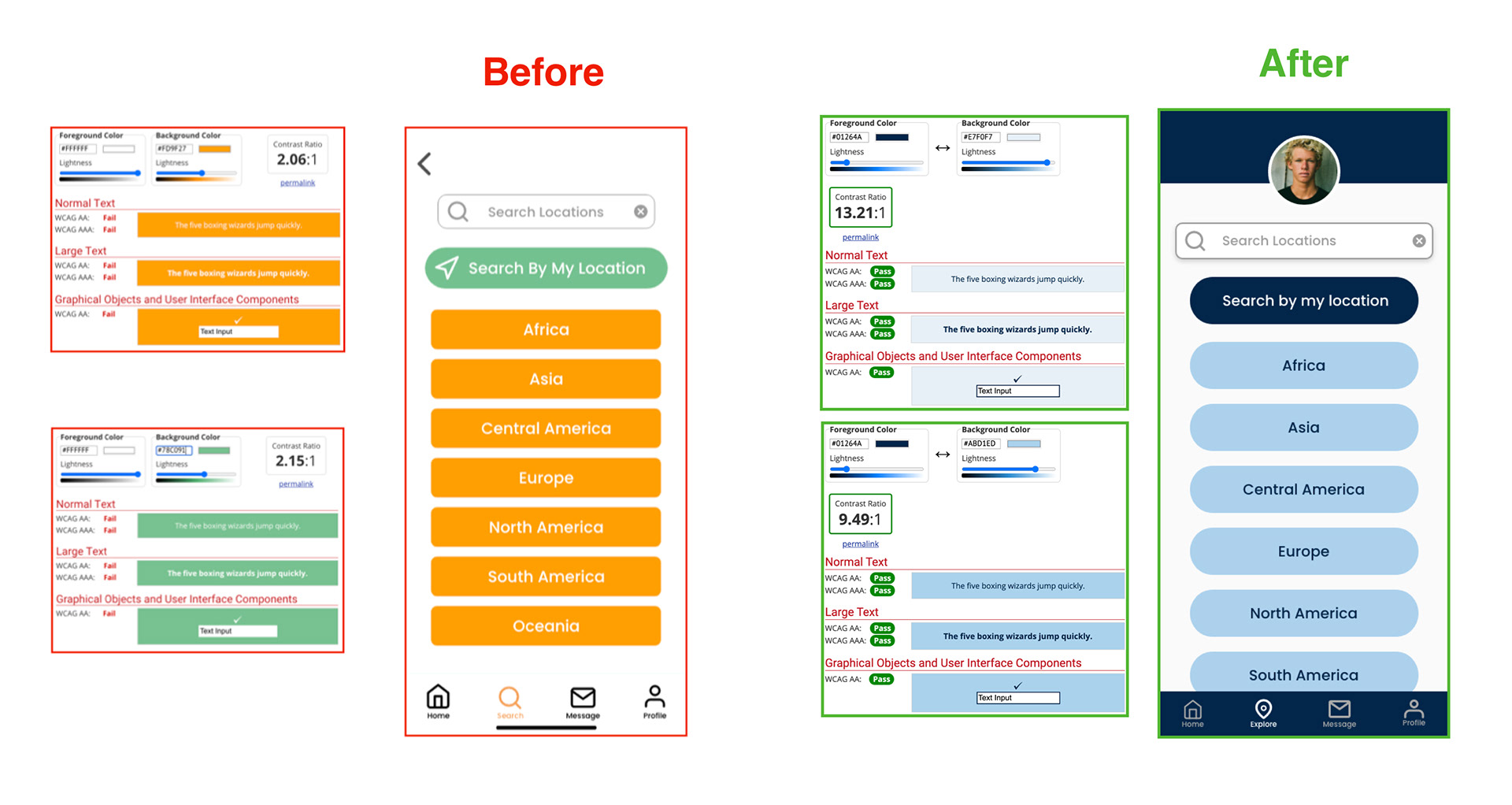
Accessibility
In addition to the design changes made from user testing insights, I tested the initial color scheme to determine if it met accessibility requirements. The white on green and orange failed spectacularly. I knew that a complete overhaul of a visual identity was needed. The new color scheme with shades of blue, white, and grey exceeded WGAA requirements and improved the overall contrast ratio by a factor of 6.
05. Standardizing the Design
Style Guide
To maintain consistency throughout the design process, I created a style guide to help developers and designers as a reference. The colors are fun, cool, and inviting. Icons are from "Feather", an open-source icon family, which emphasizes simplicity and soft edges.

06. Final Thoughts
Due to this being my first UX project, there were plenty of mistakes and lessons learned throughout the design process. The best way to learn is by doing!
What Went Well
- Exploring and learning new design tools to help build an app from idea to final prototype
- User testing showed that design is iterative and often will not be perfect on the first attempt
What Didn't Go Well
- The process was slow due to the learning curve
- Holding onto design ideas that ultimately did not test well with users
- Accessibility guidelines forced a change in color choices
Key Takeaways
As a designer, I must be aware of biases and heuristics that may cloud judgment and instead rely on iterative design strategies to test and validate my designs.
Overall, I found that I enjoyed the research and testing portion of the project - competitive research, user interviews, and user testing. These gave me the insights I needed before, during, and after the design process to verify my designs.