Summary
A local fast-food chain is going through a rebranding and website redesign. I was tasked with providing Papa Al's (then known as Cheek’s Chicken) with recommendations and suggestions on how to improve the website and online ordering experience, as well as guiding them through a rebranding process.
TIMELINE: 2 Months
TOOLS: Zoom, Miro, Pen and Paper, Sketch
ROLE: User Researcher, Designer, and Strategist
1. WHAT AM I DESIGNING FOR?
Stakeholder Interviews
Before I began the redesign, I first interviewed the business owners to understand what issues they were facing and make sure my design addressed their needs. I spoke with the 2 business stakeholders who each own an individual location and they shared with me their goal of rebranding the current company. They wanted to establish a brand that represented quality southern food for local blue-collar families. Due to the collapse of a previous business deal, they were looking to separate themselves from their old identity without confusing existing loyal customers.
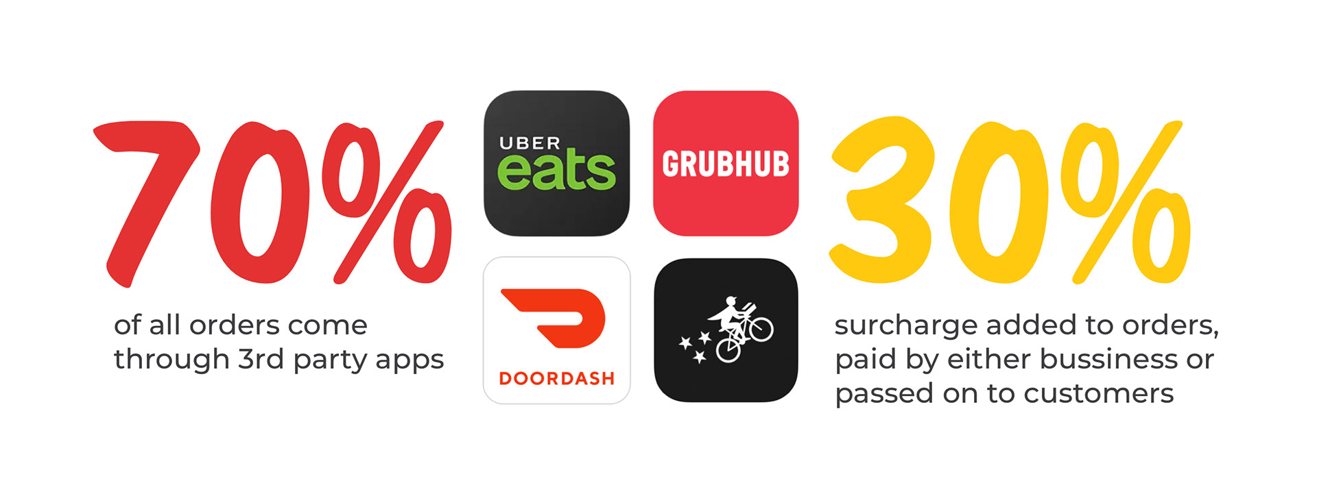
Additionally, COVID-19 increased its reliance on online ordering systems. While the restaurant does offer an online ordering system, 70% of all orders come through 3rd party apps. Each order imposes a 30% surcharge either to the business or customer, impacting cost for both.
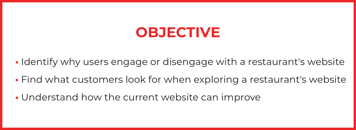
2. DISCOVER
Cognitive Walkthrough
I contacted 6 participants who lived within driving distance of each location to record their insights. Through a combination of screening, tasks, and post-task questions, I learned valuable information about their online food ordering habits, preferences, and considerations.
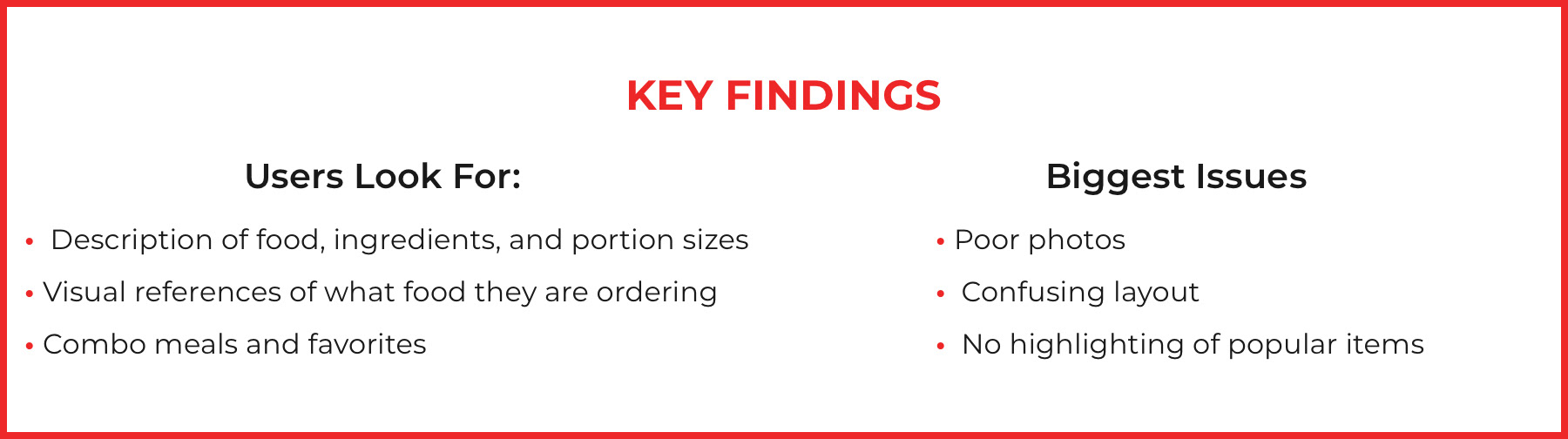
Patterns quickly began to form as users talked about an overwhelming, almost aggressive, visual experience. Inconsistent and sometimes missing photos raised concerns about the quality of food. One participant quipped "They've done the impossible task, making fried chicken look unappetizing".

"I want to support local businesses as much as possible."
"I look to see what is popular with other people when trying a new restaurant."

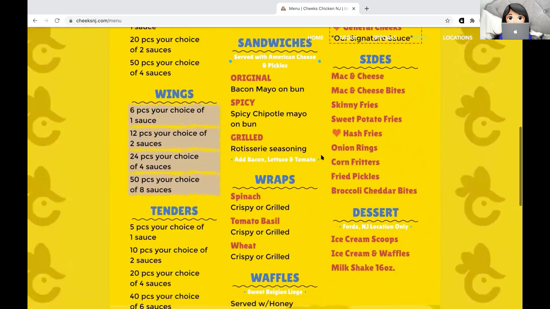
"Why aren't there prices?"
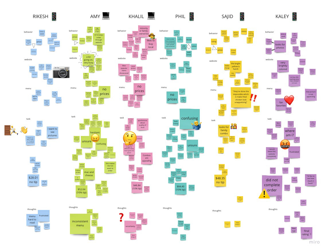
Affinity Mapping
After taking notes during the cognitive walkthrough, I compiled quotes, actions, and insights and organized them on a digital board to find what were common themes I could build upon. Surprisingly, some user preferences directly contradicted others. What was easy for one participant was confusing and difficult for another.
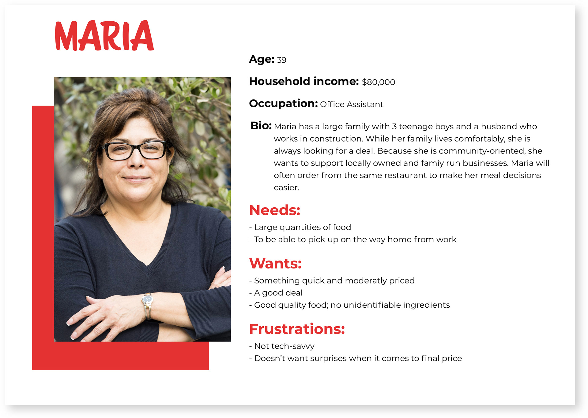
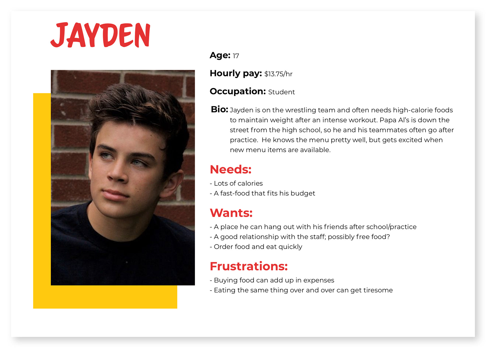
User Personas
Based on stakeholder interviews and insights from user feedback, I compiled personas of two customers Papa Al's could expect to cater to. I referred back to these personas throughout the design process to make sure I am aligning with their needs, wants, and frustrations.
03. DESIGN
I now understand the business needs, customer wants, and issues with the current website. Keeping all these factors in mind, I created multiple iterations of the logo and website design to meet the expectations of both the business and customers. This is where creativity meets constraints.
Logo Design Iteration
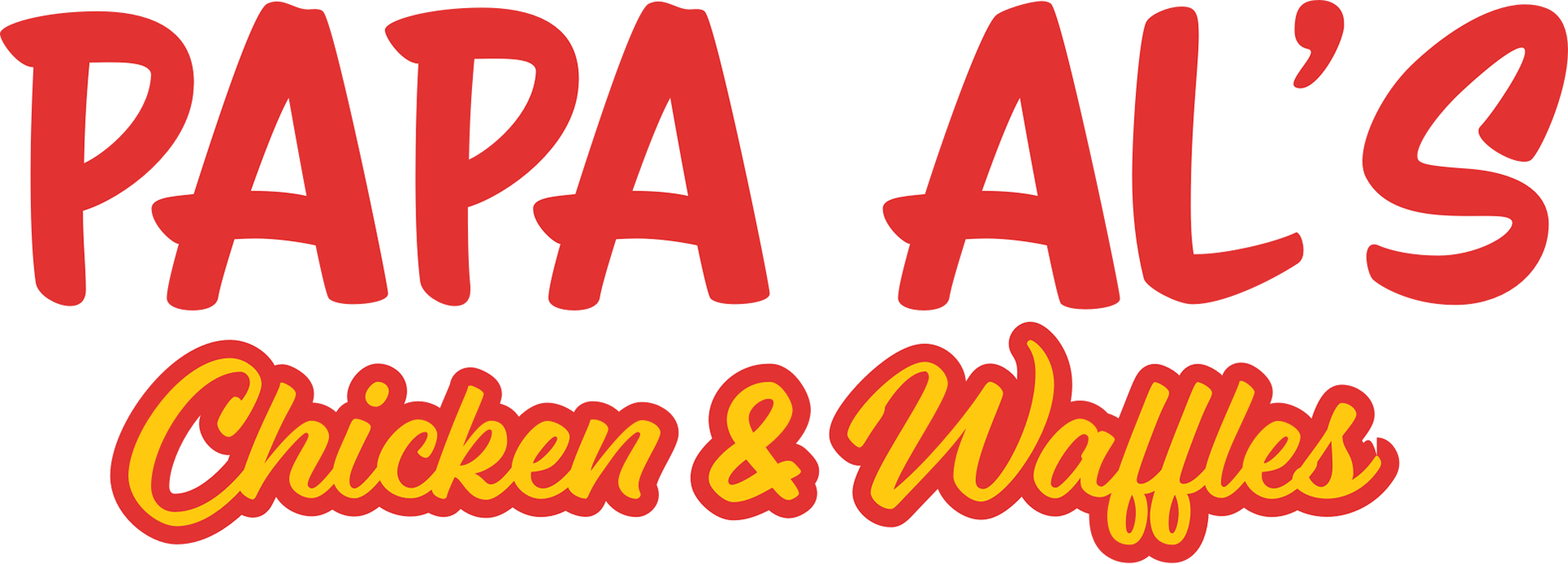
After deliberation, the stakeholders decided on "Papa Al's" as the new name of the restaurant. There were only two requirements when it came to the new brand identity: keep the red and yellow color scheme, make it friendly.
When I first heard "Papa Al's", it invoked a picture of an old Southern gentleman selling fried chicken based on a family recipe out of the back of his ’51 Chevy pickup. Considerations and questions I asked myself: What would customers expect with a name like "Papa Al's"? What would the atmosphere be like? How can I create an image of a family-friendly wordmark?

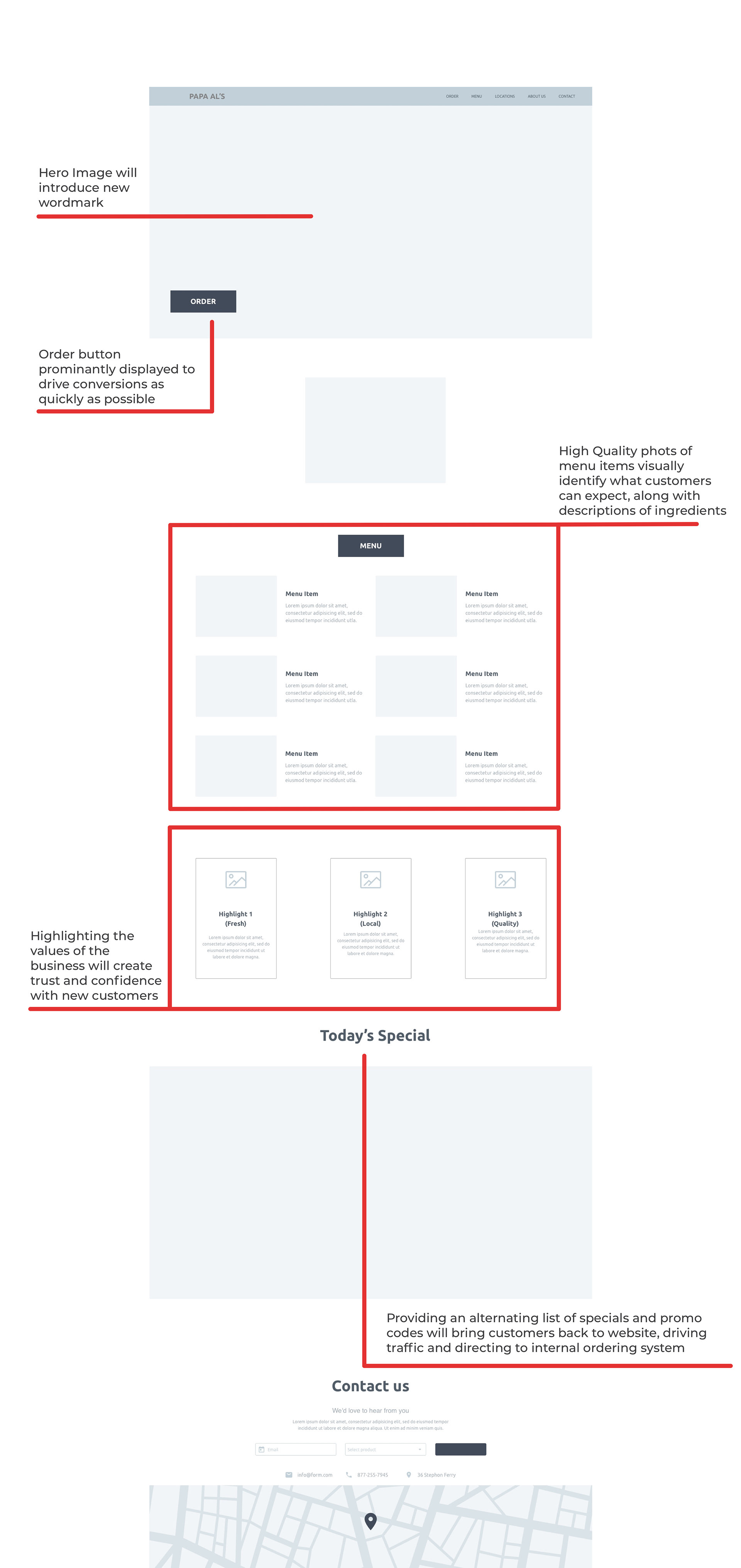
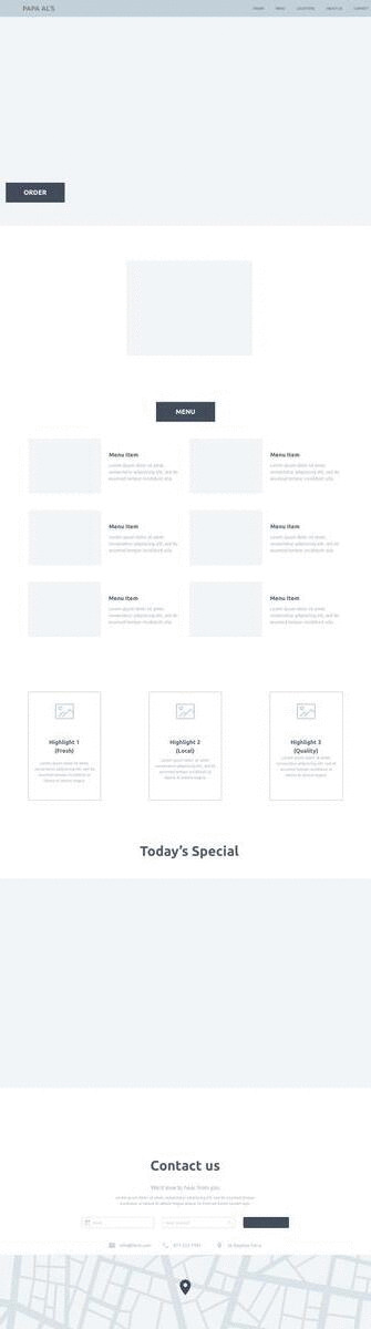
Low Fidelity Wireframe (Web)
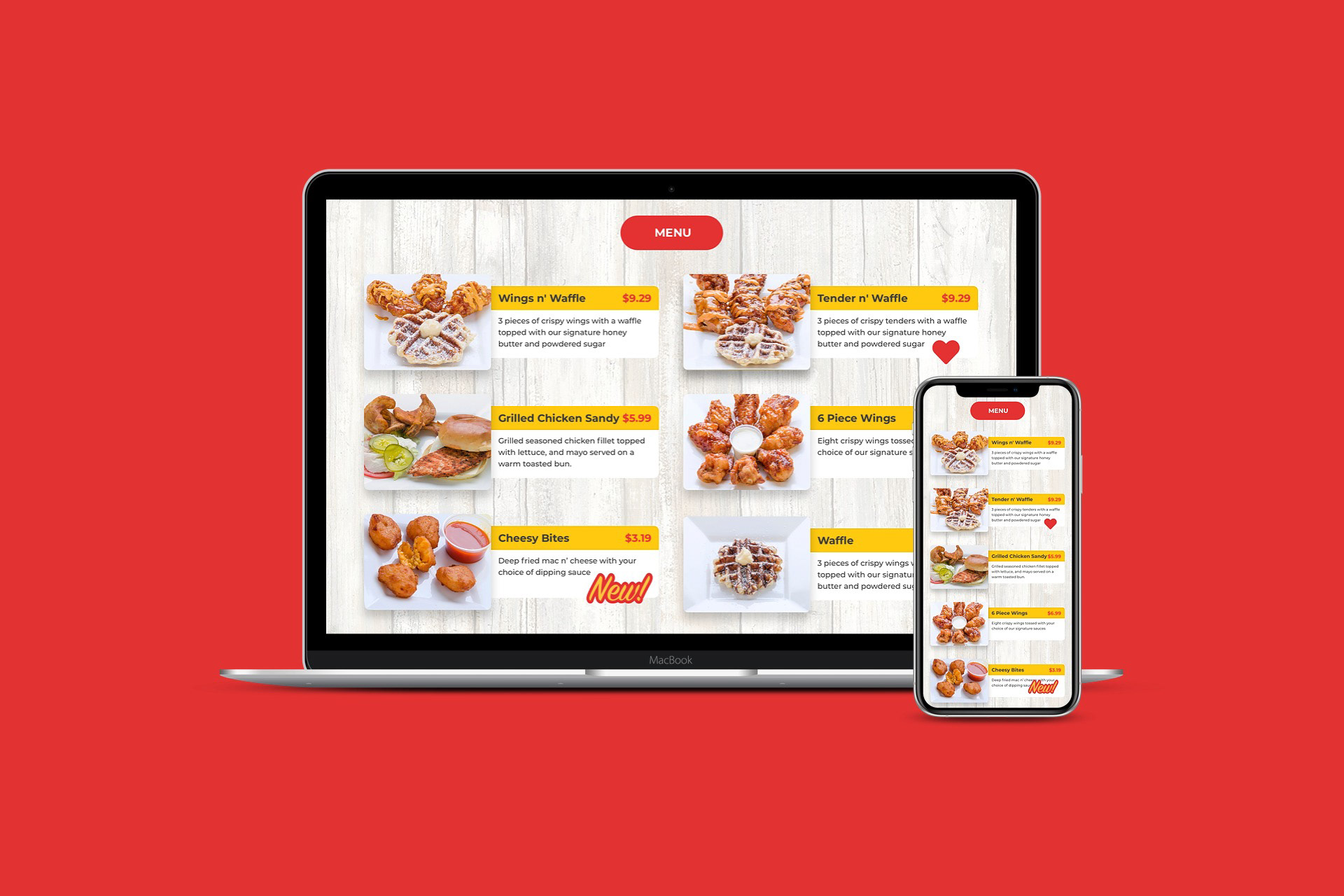
Based on my findings from stakeholder interviews, user testing, and cognitive walkthroughs, I created a low-fidelity wireframe to explore features that would meet the needs of both business owners and customers. The introduction to the new logo would have to maintain familiarity while making a marked impression. Menu items with photos would be featured, as well as detailed information such as customer favorites. Weekly promotional coupons can be used for online ordering, offering a discount for customers, and keeping them coming back to the site. Finally, featured highlights about the business and food will create a sense of familiarity and trust with new customers.
High Fidelity Mockup
Because this was a full rebrand for the business, I opted to jump straight into a high-fidelity mockup to confirm with the stakeholders that the visual identity was going in the right direction.
Once the first version was submitted, the business owner was not fully satisfied and requested a more "southern" feel. I contemplated his request and tried to come up with a solution that would be effective without changing the design completely. I opted to use a barnyard background to maintain visual cohesion throughout the page. The redesign was met with enthusiasm by the stakeholder - "This is exactly what I was talking about".
Design System
Final Mockup - Web and Mobile
04. FINAL THOUGHTS
Working directly with stakeholders offered an opportunity to understand their goals behind a redesign and how to navigate the business needs with the user wants. As the designer, it was my job to meet the stakeholders where they are and find out what their vision is for their business. Receiving and interpreting feedback is essential to a successful design project.
In order to determine the effectiveness of the redesign, I would compare metrics such as website traffic, number of orders through website vs. 3rd party apps, and use of promotional codes in online orders.